visualize your datain real time.
Load your datasets, interactively analyze them, tweak filters, and play around with every dimension. When you’re ready, export the polished charts as downloadable reports for your team.
Load your datasets, interactively analyze them, tweak filters, and play around with every dimension. When you’re ready, export the polished charts as downloadable reports for your team.
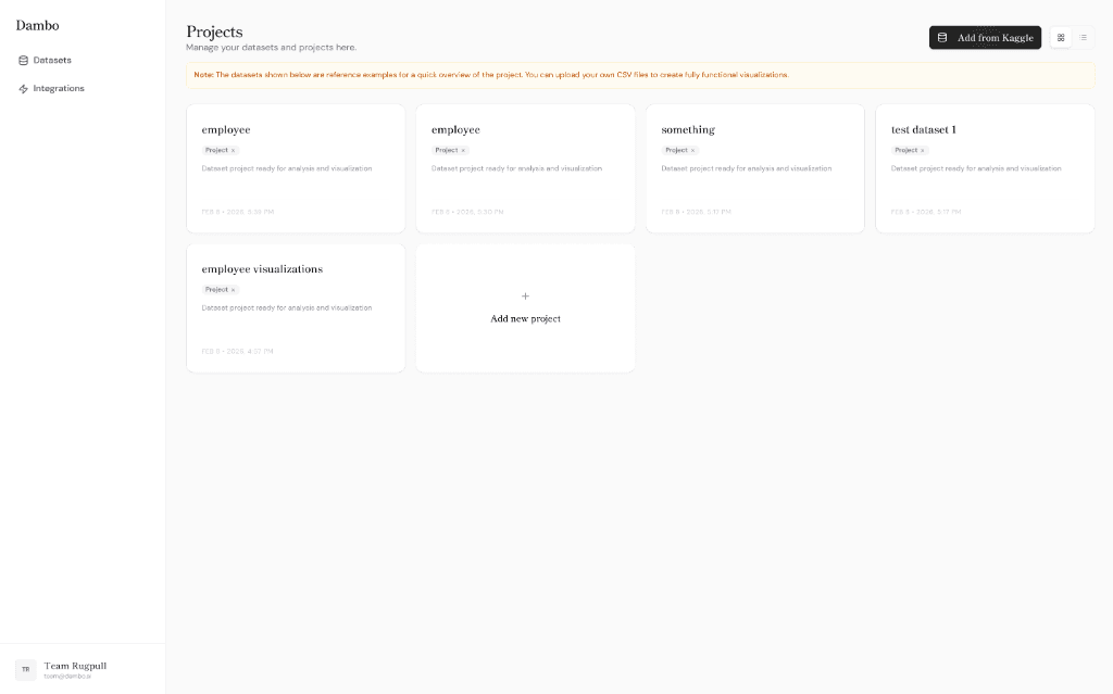
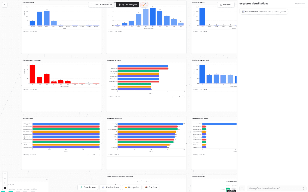
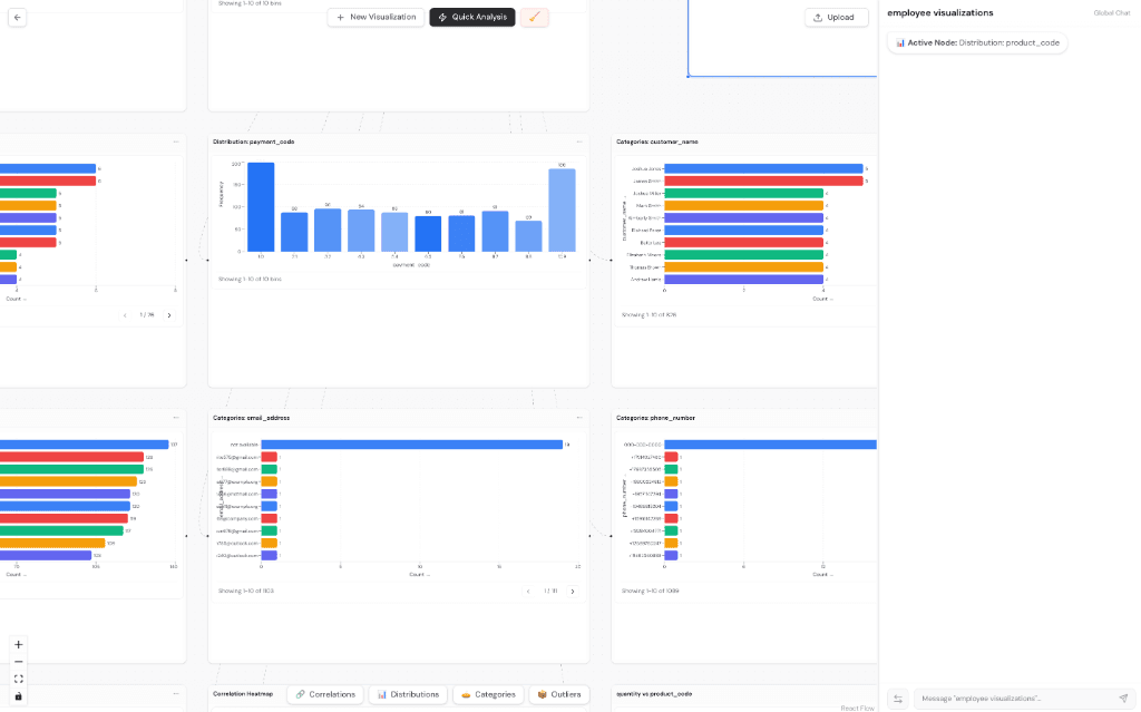
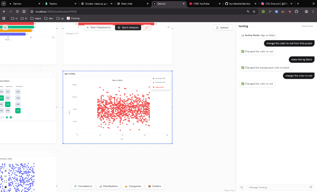
Dambo is a conversational data visualization tool. Upload a CSV, describe what you want to see in plain English, and watch your charts appear on an infinite canvas. No configuration dialogs. No dropdown menus. Just type.
Drag one chart node onto another to instantly trigger an AI-powered comparison. Dambo analyzes distinctions and highlights key insights automatically.
Need a different perspective? Just say "convert to heatmap" or "show as list". The data remains, but the visualization adapts to your needs instantly.
Skip the configuration menus. Dambo understands your data's context and suggests the best visualizations based on your plain English queries.
Under the hood, Dambo uses Tambo—an AI framework that turns natural language into React components. Each chart type is registered with a schema describing its required props. When you send a message, Tambo interprets your intent, selects the right chart component, extracts column names from your request, and renders the visualization in real-time.